Indoor signs

1/22/2023
One of our clients recently asked us to give them some feedback on their business cards. We’re always happy to share our knowledge and perspective. I’ve pulled it all together below where it can hopefully help you with your next order of business cards.
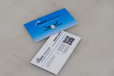
Studies show that people hold on to coloured business cards 10 times more than white ones. Go for a nice bright background colour to make your card memorable. I am partial to business cards that have a coloured background on one side and white background on the other – I think the contrast in colours when you flip the card over in your hand is very appealing.
You want a tonne of negative space on your cards! Don’t overcrowd your cards with too much information – stick to the important bits (name, company, logo, email, phone, web, address) and the information will be easier to absorb.
Use a maximum of two different fonts -- any more than that can cause clutter. We normally advise a serif font for the header and a sans serif font for the body.
We are seeing a lot of QR codes on business cards these days – drives people back to the website and the next level information on your business. That might be something to consider.
You could consider a photo on your card. It should be relevant to what you do. Studies say that it makes the card more memorable. But if I can add in my personal perspective, these can sometimes look gaudy and distracting so I tend to stay away from it.
Double check all the info is correct and is spelled properly – spelling mistakes happen way too often and invariably end up in a reprint.
The best thing you can do is consider the paper: thicker paper makes a more positive impression. Most cards are 100lb gloss cover cardstock. These are lightweight, low cost and work great when you are distributing masses of cards like you would at a tradeshow. If you are looking for a more luxurious options, then go thicker. Look for 14pt or 16pt thickness. For one client, we take two sheets of paper and glue them together to get >18pt thickness. Thicker cards are more robust and last longer.
Matte lamination on the card will add to the thickness and the durability of the card – feels impressive when you hold it in your hands.
Then to elevate the cards a little bit more, you could go with spot UV or varnish on the areas you would like to highlight on your card. A spot UV, or varnish, finish makes a section of your business card pop out slightly, so it’s raised from the rest of the card. This gives the section a textured look and allows people to run their fingers over your logo, therefore adding a 3D effect to your business card.
Hope this helps you when you are ordering your next set of business cards. And as always, we’d be happy to help! Reach out to us for a consultation
All the best,
Emma and Dan